D&B360 User Interface
D&B360 has on-premise availability from the CRM Workplace menu and cloud-based availability. It's responsive design is supported on tablets and mobile devices.
The D&B360 interface is structured by a group of gray tabs at the top of the screen and initially opens up to the Home tab. There are also some basic conventions for navigation and indicators that are used throughout the interface.

The gray tabs at the top of the D&B360 screen, along with the Search feature, are the primary way of navigating the system. Some of the tabs have a sub-menu of blue tabs providing access to additional features.
NOTE: The Settings tab is available only to Administrators. The Build A List tab and Imports tab are available to users if their administrator configured their user roles to have access to these features. Limited CRM Integration users do not have access to the Imports tab.

The information and activities available from each tab is described in more detail in the following table.
| Feature Tabs |
|---|
HomeOn this tab you will perform most of your tasks including running company, people, and industry searches, and running a company match. For more information, refer to the sections on "Running a Company Search", "Running a People Search", "Running and Industry Search", and "Running a Company Match". |
Build A ListClick this tab to start a new list or edit a saved list. |
ImportsAdministrators use this tab to view a list of all asynchronous imports. Users can view only their own imports. |
AlertsAfter you set alerts for specific companies, you can view recent alerts, manager your alerts, and manage your company triggers. |
AboutThis tab includes these tabs: About (includes information about D&B360 and Terms and Conditions. It also includes links to training information. |
SettingsThis tab is for Administrator Users and includes these tabs: Admin, Batch, Data Management, and Role Configurations. For more information, refer to the D&B 360 Administration Guide. |
|
 Help
HelpAdditional features on the screens also help with navigation.
| Navigation Features |
|---|
A Scroll bar can display horizontally or vertically and often display for lists of information. Click and drag on the bar or click on the arrows at either end of the bar.
|
The Minimize / Maximize Arrows are used to open up and close sections of the page. In the following example, the right arrow has minimized information. The down arrow displays the expanded or maximized information
|
The Results per page information displays at the bottom of search results. You can use the drop-down to select how many results you would like to see on one page. If you choose a larger number, you may have to scroll for results as opposed to paging through results. Use the left arrow to page to the previous page and the right arrows to page to the next page. You can also enter a page number and click Go to be directed to a specific page.
|
Links are often indicated with an underscore beneath the words when hovered over. In the below example, the links are external.
|
The LinkedIn icon accesses the LinkedIn external site in a new window.
|
Refresh buttons "refresh" the data by telling the system to check for updates.
|
The Help question mark indicates there is some additional helpful information available by clicking on the icon.
|
Spinner icons display in places where there may be potential wait times since data is being loaded.
|


There are a number of content selection features in D&B360. The content selection features help streamline the information you want to view.
| Content Selection Features |
|---|
Check boxes are used to select one or more items. Click in the box to the left of an item to select or unselect the item. (A check mark indicates an item is selected.) You can select or unselect all items by clicking in the check box at the top of a list (in the header row).
|
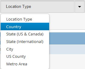
Drop-down arrow lists are used to make a single selection. Clicking on this down arrow displays a list from which you can highlight and select an item, In the following Search drop-down list example, "People" was selected and the field now displays "People".
|
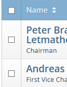
Sorting arrows appear at the top of lists in the heading row. Click on the arrows to sort a list column List arrow sorting
|
Buttons serve different functions when you click on them. Some buttons can toggle such as Enable and Disable. Some buttons complete an action, such as the Save button. Still others are used to click on to indicate a selection. |
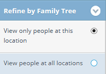
Radio buttons are similar to check boxes. They are both used to select one or more items. Click in the circle to the right or left of an item to select or de-select the item. (A filled-in circle indicates an item is selected.)
|
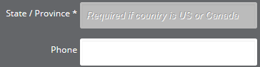
Fill in fields will either be empty or contain some description of the information intended to fill in the field. Those marked with an asterisk are required fields.
|
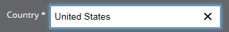
When you see an "X", it generally means you will be deleting the item or clearing it out or closing a window.
|
The Magnifying glass indicates a type of search.
|

These icons display on the user interface windows:
| Account, Contact, and Lead Icons |
|---|
|
|
 A hexagon with the letter L indicates an existing lead. A hexagon with the letter L indicates an existing lead.(This icon is available to Microsoft Dynamics CRM environments only.) |
 A hexagon with the letters L and A indicates both an existing lead and an existing account. A hexagon with the letters L and A indicates both an existing lead and an existing account.(This icon is available to Microsoft Dynamics CRM environments only.) |
 A hexagon with the letters L and C indicates both an existing lead and an existing contact. A hexagon with the letters L and C indicates both an existing lead and an existing contact.(This icon is available to Microsoft Dynamics CRM environments only.) |
 Indicates a related account. The icon helps reveal up-sell and cross-selling opportunities by indicating relationships in the corporate hierarchy with any of your existing accounts. Clicking the icon displays more detail. Indicates a related account. The icon helps reveal up-sell and cross-selling opportunities by indicating relationships in the corporate hierarchy with any of your existing accounts. Clicking the icon displays more detail. |
 A hexagon with the letter A indicates an existing account.
 A hexagon with the letter C indicates an existing contact.
| Contact Information Icons |
|---|
|
|
|
 An email icon displays for Premium people and provides that person's direct email address after you have used a credit to purchase it.
 A phone icon displays for Premium people and provides that person's direct phone number after you have used a credit to purchase it.
 Email and phone icons display for Premium people and provide a person's direct email address and direct phone number after you have used a credit to purchase them.
NOTE: The phone, email, and phone/email icons are blue the associated record has not been purchased. After a record has been purchased, the icons display in yellow. For more information on purchasing records, see the "D&B360 Packages" section.
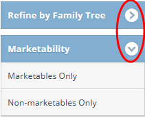
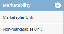
Marketability Filter
When you view company or people results, you can filter your results based on a company's or person's marketability. The Marketability filter displays at the top of the filter area on the left.
Marketability filters are displayed on the Company Simple Search and People Simple Search pages.
Click Marketables Only or Non-marketables Only, depending on your search requirements.
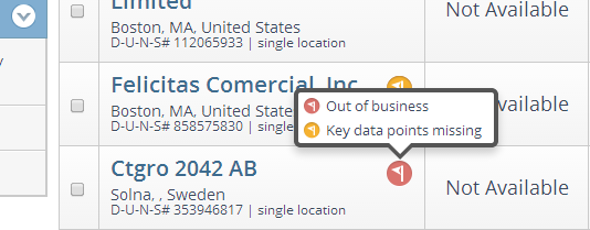
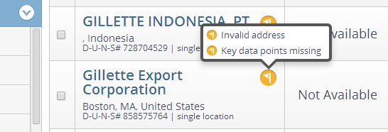
Marketability Flags
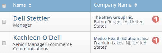
If a company is considered non-marketable, the marketability flag displays. Click the flag to see the reason it is considered non-marketable, which can be Out of business (displays as a red flag), Key data points missing, Requests no marketing contact, or Invalid Address.
Marketability Flags are displayed on the Company Simple Search Results, Match Results, People Simple Results, and Company Overview pages.
The flags display for people results if the company they are associated with is not marketable.
- © Dun & Bradstreet, Inc. 2019 – 2025. All rights reserved.